
Context Carousell 2022 Q2
Role Lead Designer
Timeframe 3 months
Phases Discovery, research, ideation, delivering final assets
Collaborators Product Manager, Engineers, User Researcher
Project Overview
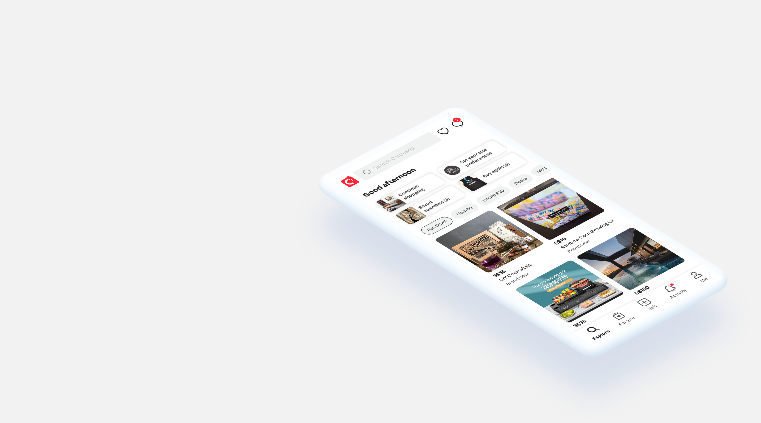
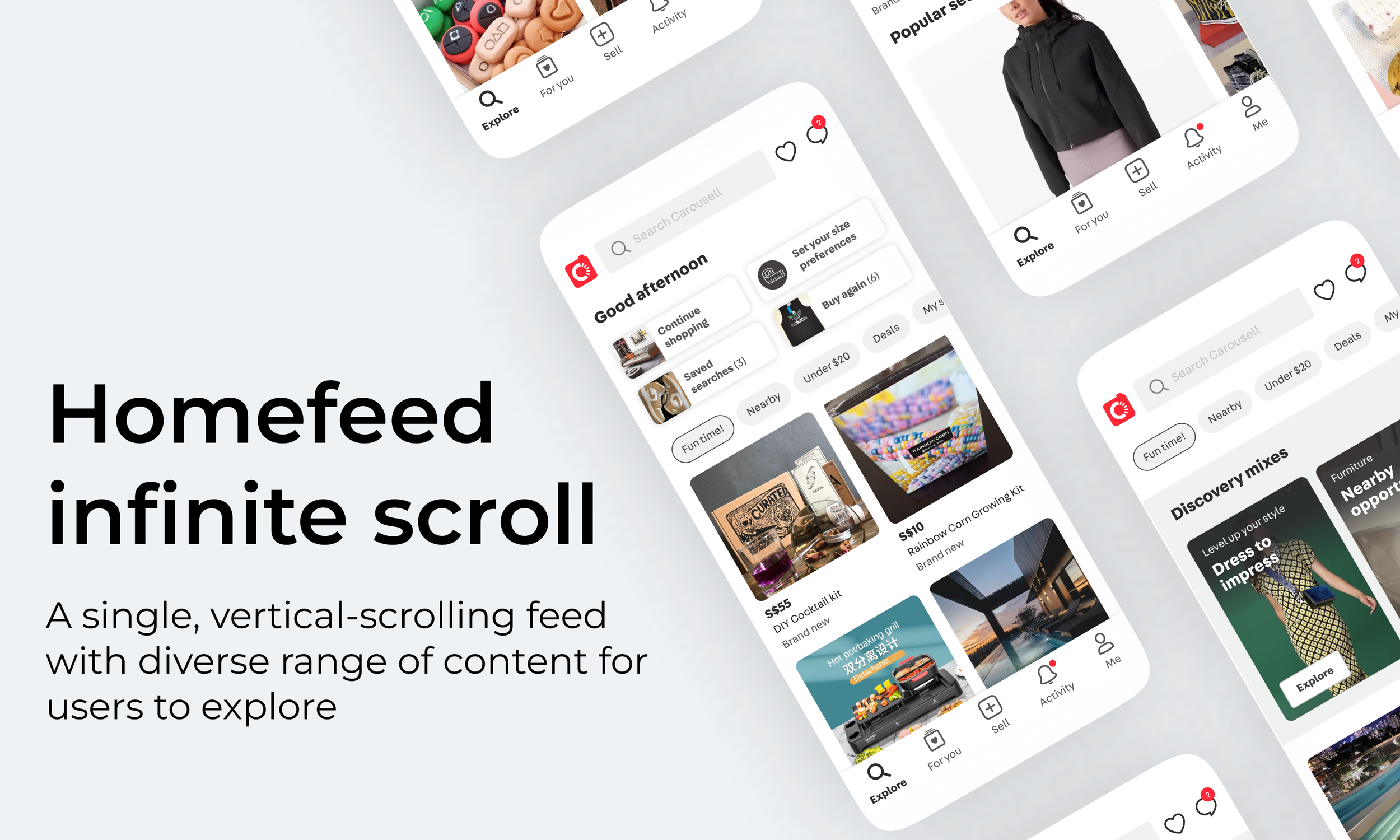
HomeFeed is the landing tab that stitches together a diverse range of content into a “single” feed for users to scroll through in a leisurely manner.
Problem
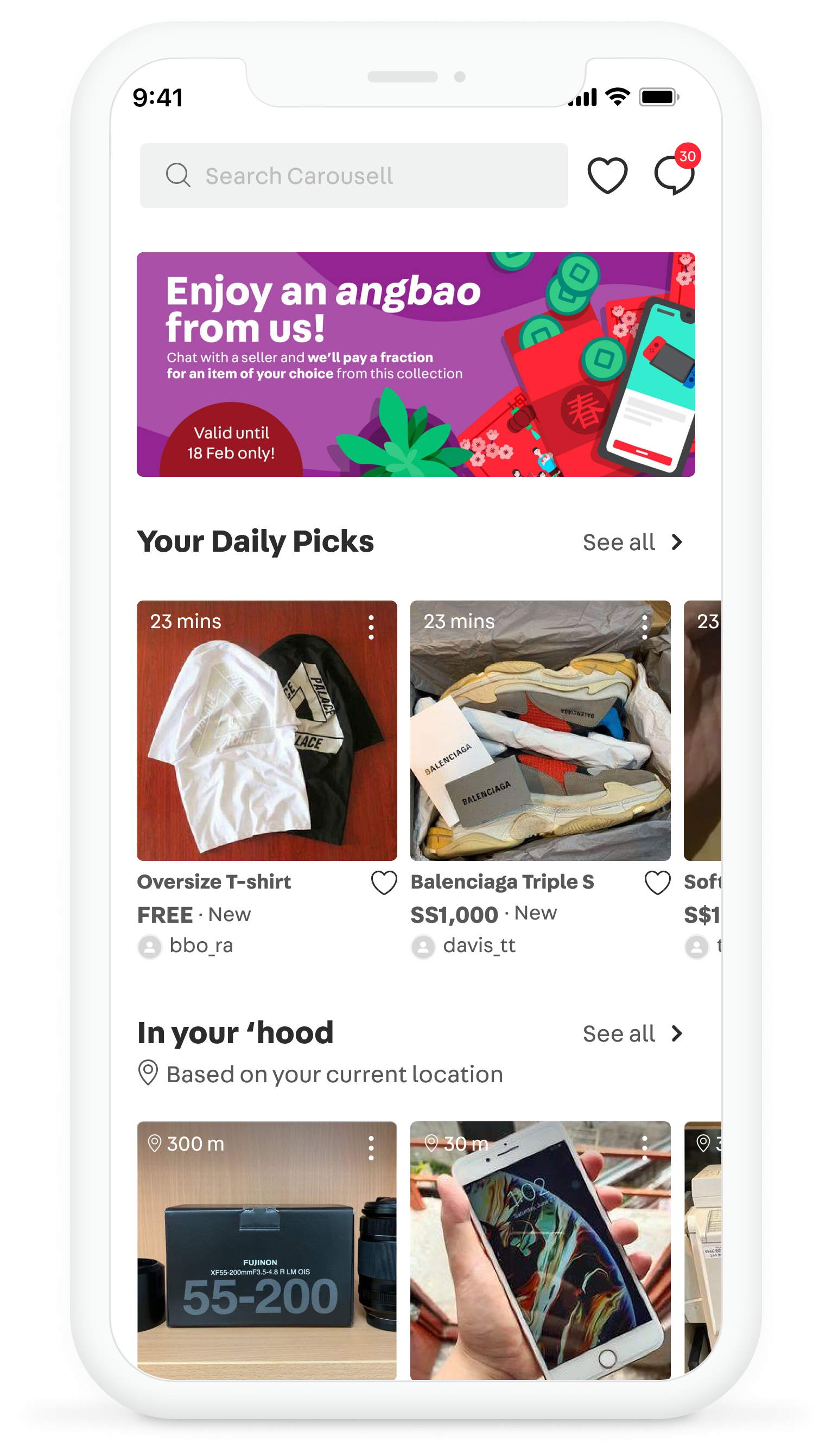
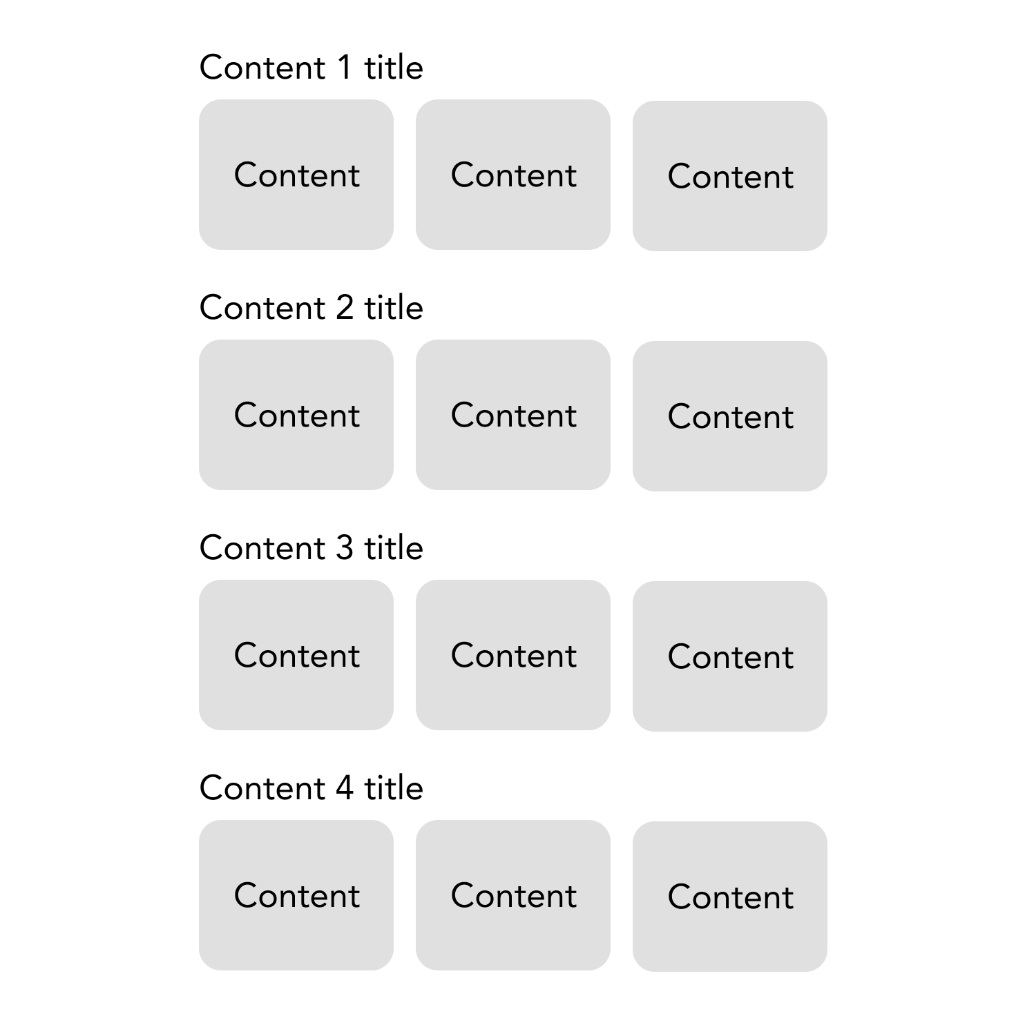
The current Explore (landing) tab is a vertical stack of predefined set of content sections. This exposes many challenges:
Cannibalization when new content sections are introduced
Predictable and easily ignored by users. Not dynamic enough to provide a sense of surprise or wonder.
Not easy to cover a wide variety of content or easily experiment with new content types
How might we increase user engagement on the landing tab to increase lazy browsing?
Goals
Business goals
Increase user engagement on homescreen
Increase listing views per week
Build a user habit around browsing on our platform
User goals
Discover interesting items
Solution
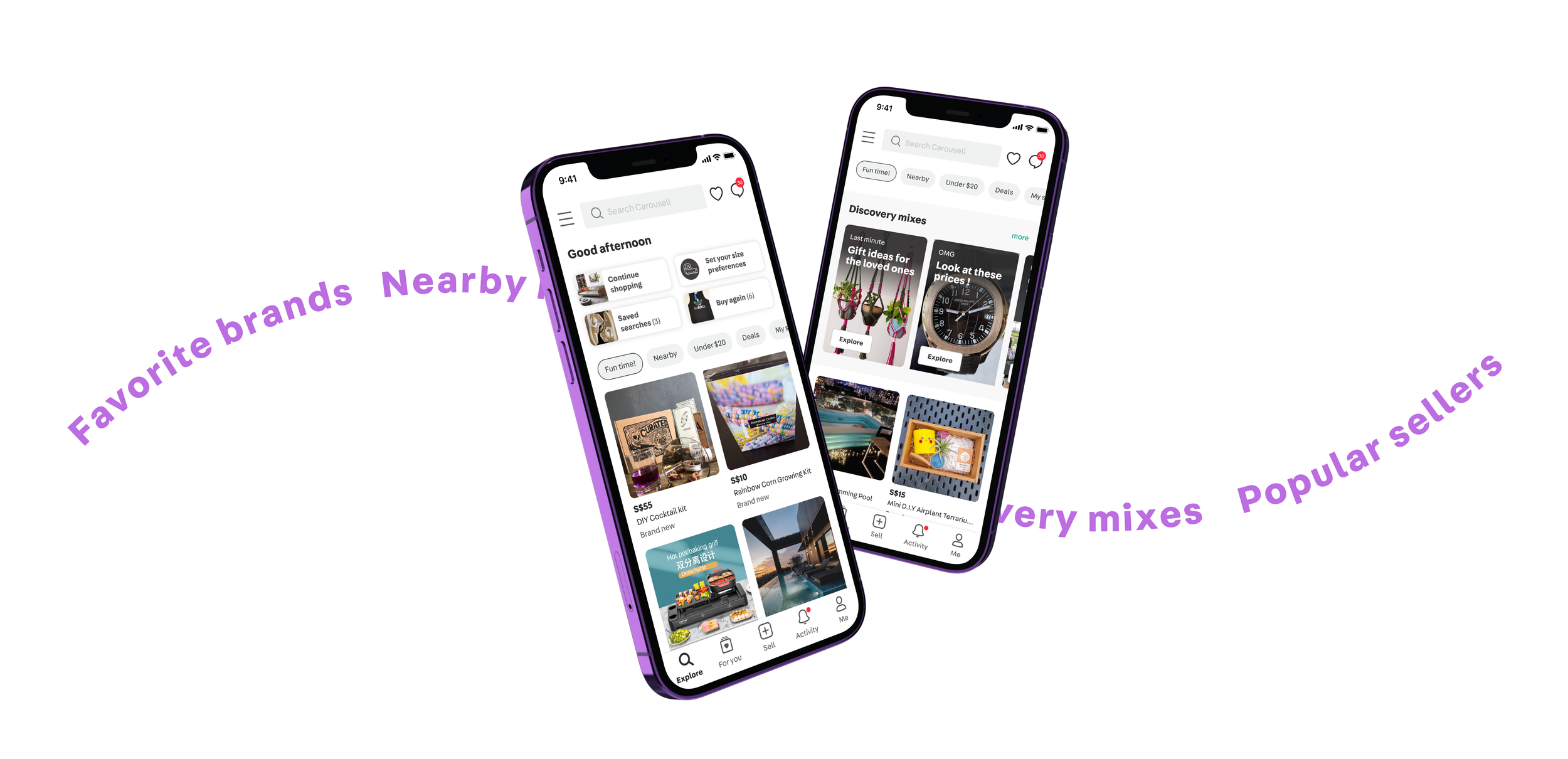
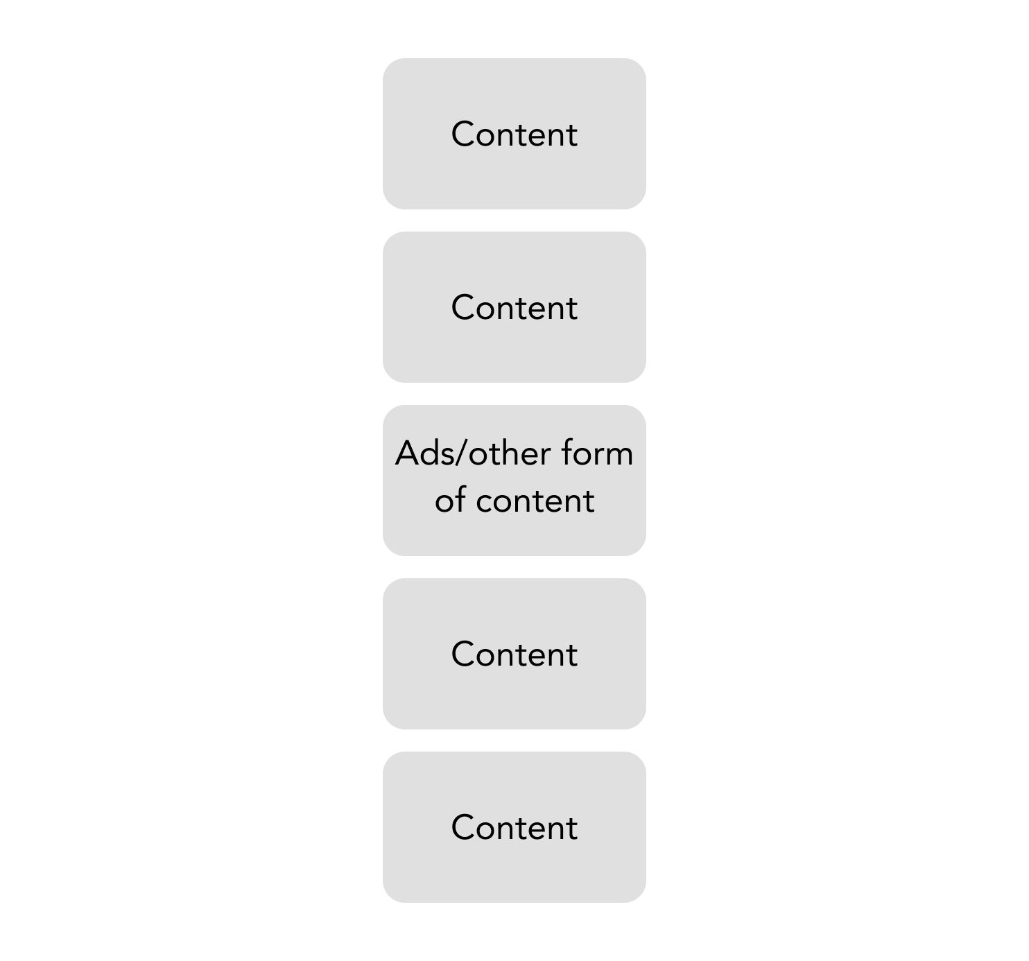
Our design is to use one algorithm as the backbone vertical ‘feed’ and slot in some ‘breakers’ in between the feed instead of stacking sections one on top of another.
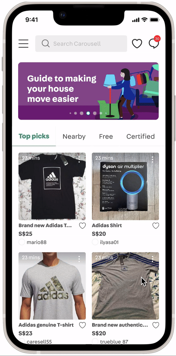
Before
After
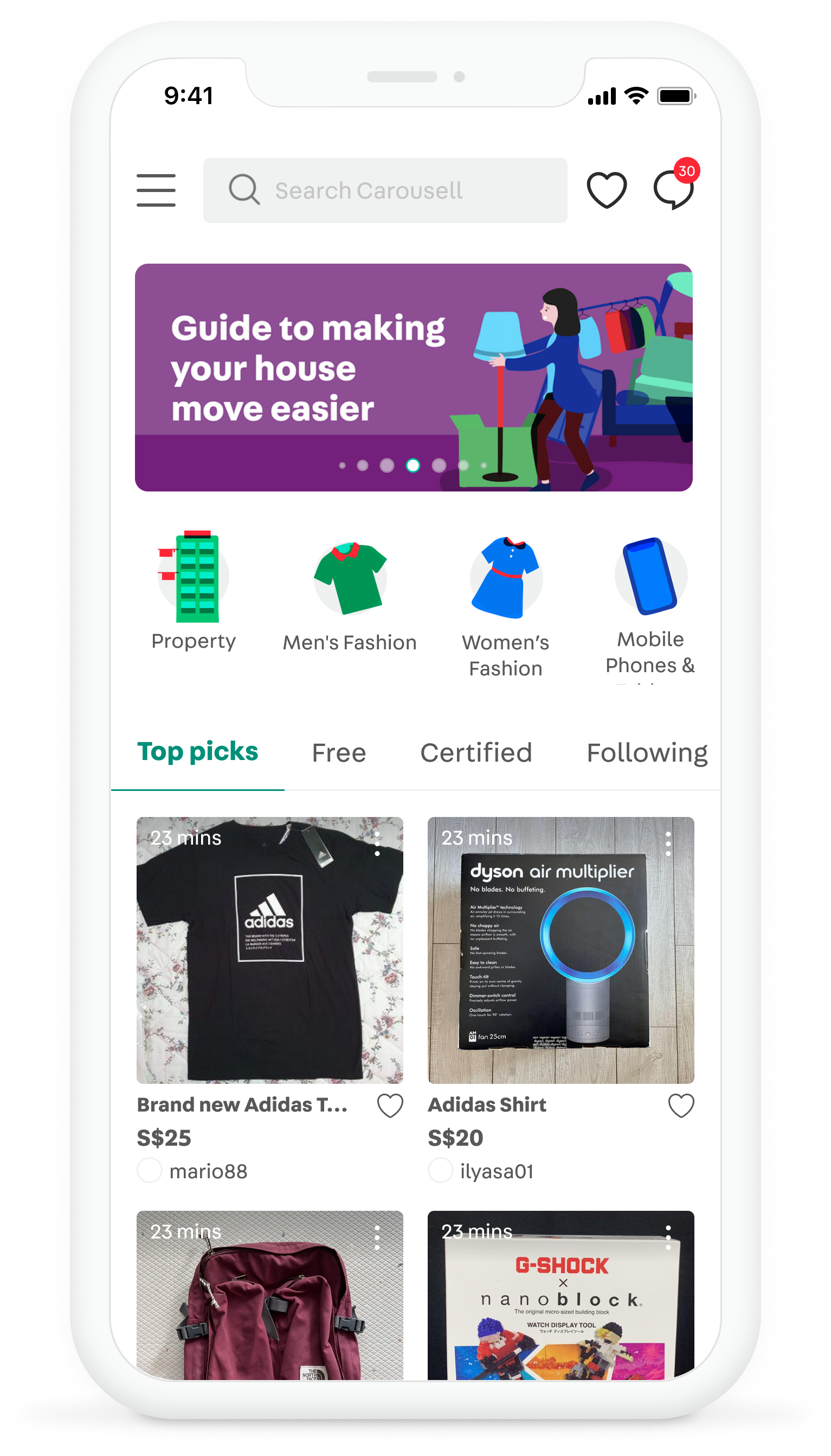

Vertical infinite scroll
Move from stacks of horizontal scroll sections to a single vertical infinite scroll feed
Navigate different content through tabs
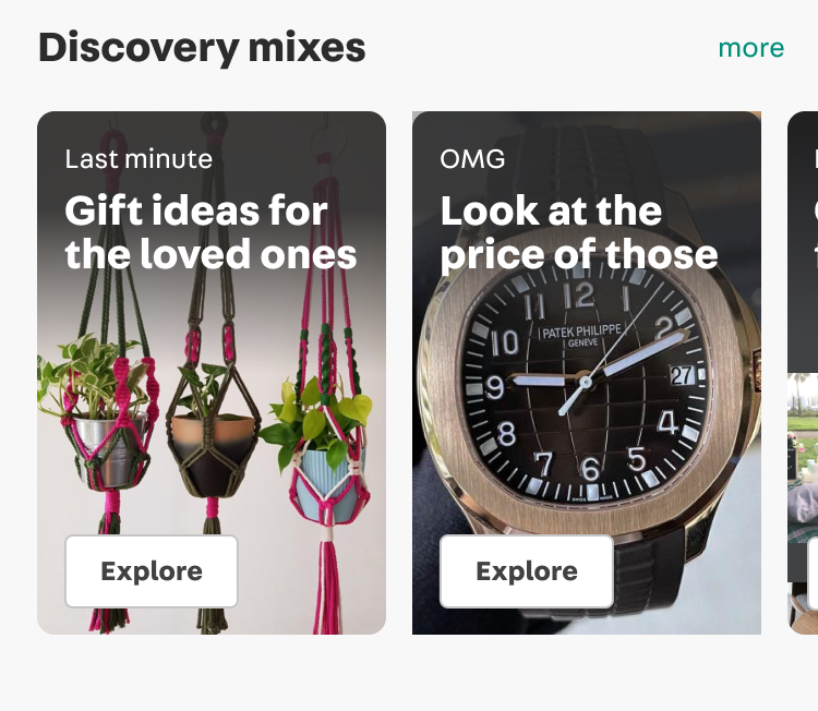
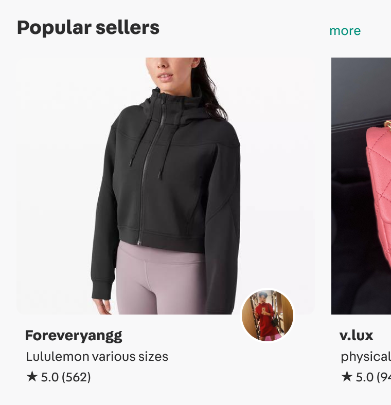
Homefeed breakers
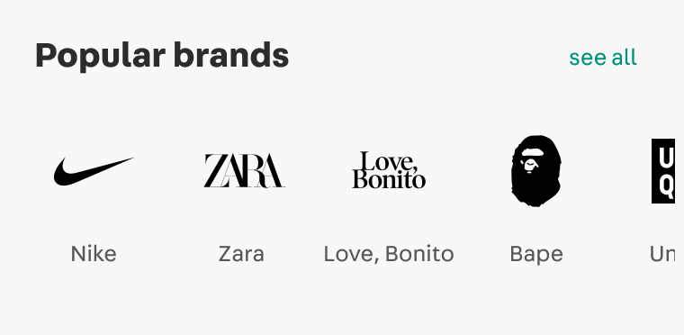
These ‘breakers’ allow us to slot in external ads, sections for our focus categories (services, property, and automobile), and other types of explorations like ‘popular brands’ and ‘popular sellers’
Design Process
Understanding user pain points
Most users don’t explore (i.e. scroll down) the homescreen because they are not relevant or interesting enough for them
While search dominates, we see signals that users are keen to explore the breadth of Carousell

“I feel that it is very messy. it's just a lot of different categories. First of all, I'm looking at slashed prices, then I'm looking at home services, then after that I'm looking at recommended for you. It's just way too many categories that my eyes are all over.” - Vanessa
Our homescreen lacks a distinct purpose, resulting in competition with Search and ultimately leading to failure
Competitive analysis
I conducted an analysis of various platforms featuring content feeds to explore the advantages and disadvantages of a fluid vs modular layout.
Fluid
One endless vertical-scrolling feed that keeps users engaged with a diversity of content formats
e.g. Facebook, Youtube, Instagram
✅ Better suited to keep users scrolling
Modular
Compartmentalized sections stacked one on top of the other that lead to its own individual content feeds
e.g. Amazon, Poshmark, Netflix
Defining design success
Principle 1
The moment-to-moment experience needs to be engaging
Principle 2
The homescreen needs to be a destination.
Principle 3
Help users build a recurring habit to explore the breadth of Carousell
We must first craft a captivating main feed to encourage users to develop a browsing habit. Then, we can start introducing sections intermittently to pique their interest.
Concept testing
Testing the vertical scrolling experience
“I find that the layout is nicer than the current”
“I think the new version is quite nice, the interaction. It feels like there is more things to shop around for”
Testing different breaker content types
Popular brands and sellers are two sections that received the most interest from users. These two types of sections are good ways to organize content in a coherent way for users.
Results
Increase in %Respondents (chat about a listing) from homescreen
Views of our focus categories (Cars, Services, Property) also increased
SG: +11.6%, HK: +26.7% increase in % Cars Listing viewers
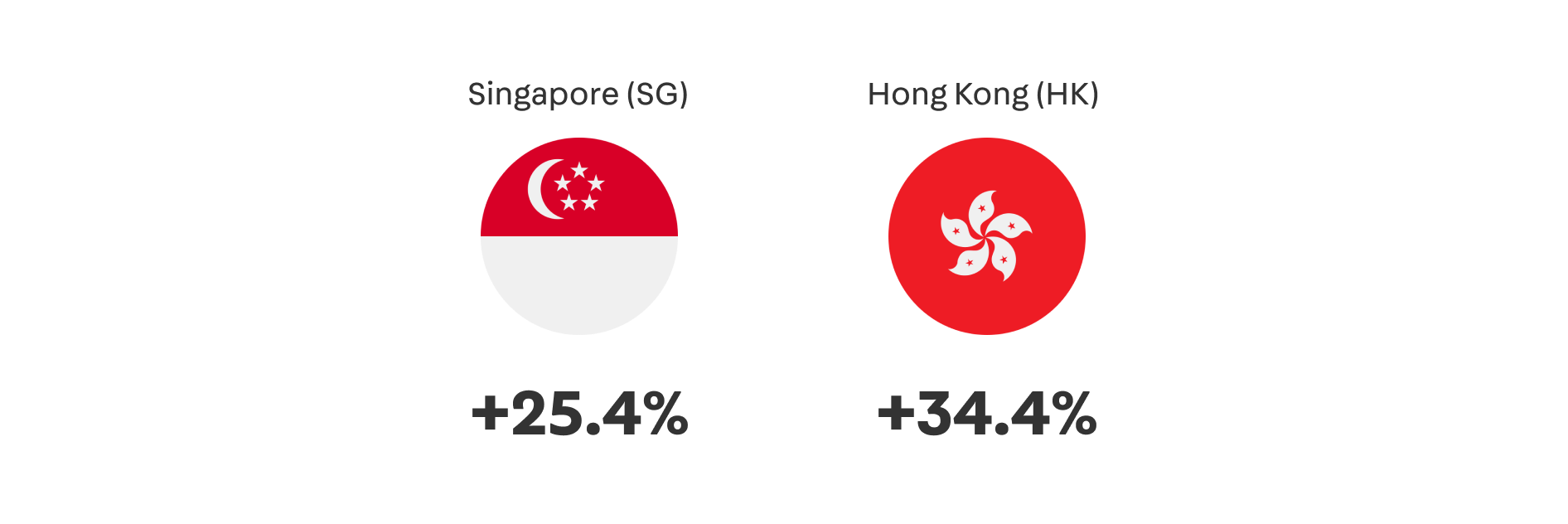
SG: +34.4%, HK: +40.3% increase in % Services Listing viewers
SG: +20.2%, HK: +11.0% increase in % Property Listing viewers